Meet the New Mobile Menu Customizer

Today we introduce awesome new features added to the Divi Pixel plugin! In this update our team was working on header and mobile customization settings 🥳 🎉
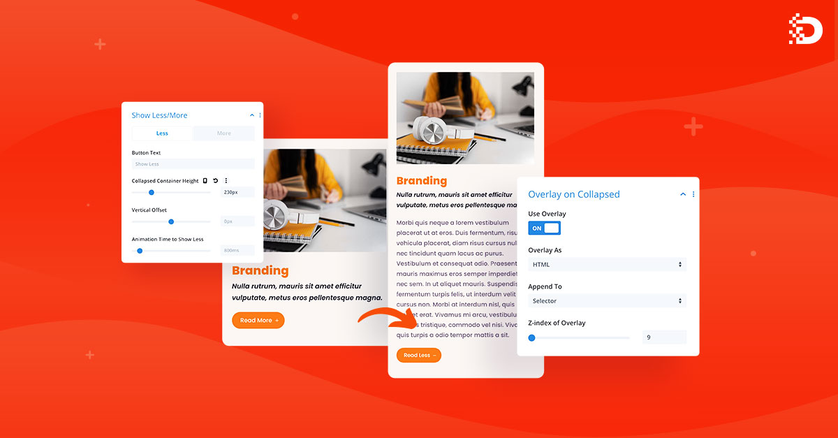
Our team has fixed a few minor issues, improved header settings performance, and most importantly, we added brand new settings into Mobile Menu Customizer that you are going to love! Divi Pixel now offers a complete solution for the mobile menu customization. You can add animated hamburger icon, social icons, customize texts, make the mobile menu fullscreen, add custom animations and more!
Let’s take a look at the new mobile menu customization experience!
Make your mobile menu just awesome
Divi Pixel comes with a complete list of settings that will help you build more awesome and unique mobile menus than ever. One of the core options is Fullscreen Mobile Menu which gives a totally new mobile menu look. You can select animations for the menu items and for background overlay individually. We have added a new Circle Effect for background overlay animation and it’s awesome! Take a look:

Hamburger Icon Customization
Designers nowadays experiment a lot with animations to give their designs awesome effects. In web design, animating things on certain events creates a much better user experience if done correctly.
With the Divi Pixel, you can add animation to your mobile menu icon with one click. Select one of the 9 animations available and customize it just like you want. You can change icon color, make the icon boxed, add border-radius, change the background color and more!
Customize Mobile Submenu with Ease
The number of mobile phone users worldwide today surpasses three billion and is forecast to further grow by several hundred million in the next few years. Optimizing websites menu for mobile users is crucial.
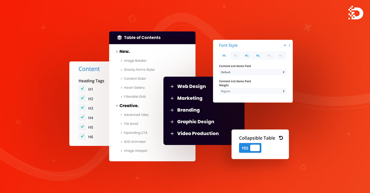
We have added a bunch of completely new settings to the Divi Pixel Mobile Customizer. These settings are going to be very useful for more complex menus, where we need to display submenus as well. The new options allow customizing submenu items, so we can finally group our menu in a more intuitive way for the users and make it mobile-friendly.

Nested Mobile Menu Improvements
Having a large number of menu items on a mobile menu isn’t a good idea. It will make users confused and having scrolling to find the proper page they are looking for. The nested menu can help, especially if it’s done right and offers a smooth experience.
Divi Pixel has already offered the option to collapse mobile submenus, but in this update, we made huge improvements that will enable you a sea of possibilities.
We have added a new group of settings for the Collapsed Menu Button icon. New settings allow selecting button icons for collapsed and opened submenu individually. During developing these features, our team focused on performance and user experience, so the submenu opens smoothly and we can see a nice button icon animation, which can be customized. We can select colors, make the icon boxed and add border-radius to the button icon.
Those all improvements we made take the Divi Pixel Mobile Menu Customizer to the next level. With the new settings you can build more complex mobile menus with minimum effort.
Take your designs to the next level and save time and money by using the Divi Pixel Plugin. Select your plan and start building awesome websites today. We offer a 14-day money-back guarantee, so joining Divi Pixel is 100% risk-free!

Maciej Ekstedt
Maciej is the co-founder of Divi Pixel. He is a self-made web designer and marketing expert, and he loves his job so much that he barely leaves the office. He transforms creative ideas into effective strategies for his company. Maciej is fascinated by the phenomenon of a megalopolis. He notices patterns and details which make up the whole thing, and he uses these skills in his work.
Enhance your Divi Theme with Custom Settings and New Modules. Start Creating Awesome Websites with the Divi Pixel
We offer a 14 Day Money Back Guarantee, so joining is Risk-Free!