Custom Modules
One of the most powerful features Divi Pixel has to offer is our custom Divi modules. Divi Pixel comes with 27 fully functional modules which will help you to build more interactive and stunningly beautiful websites – and the best part is that we’re always working on adding more custom modules!
All modules can be individually disabled globally in Divi → Divi Pixel → Modules in case you don’t want to use any of them.

Before & After Slider
The Before & After Slider is a powerful module that comes with the Divi Pixel plugin. It’s great for showcasing work in progress or overall results. Whether you’re a graphic designer who wants to show off your editing skills, or you’re a photographer or makeup artist, you simply add two images to make this work. Users will be able to move a slider to easily compare the before and after images.
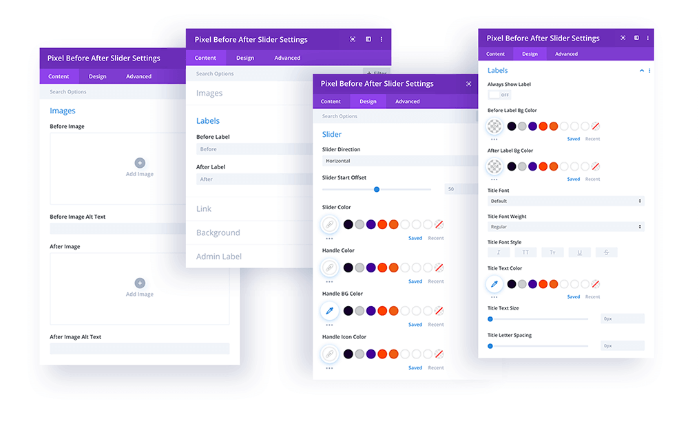
Content → Images
In this section you can add the two images: Before Image and After Image. You can also set Alt text for SEO.
Content → Labels
Here you can define and edit the text for the Before and After labels.
Design Settings
The design settings let you customize all the module elements to match your website’s brand and style.
Slider – Customize slider direction (horizontal/vertical), initial position, and colors
Labels – customize label backgrounds, fonts, colors, and style
Overlay – Enable image overlays and define colors.
Flip Box
With the Flip Box module, you can create interactive blurbs with a twist. Reveal additional content on the back of the module on hover. You can add an Icon and/or Image, Title Text, Descriptions, and a Button on both sides independently. This module is great for showcasing your portfolio, services, events, products, and more!
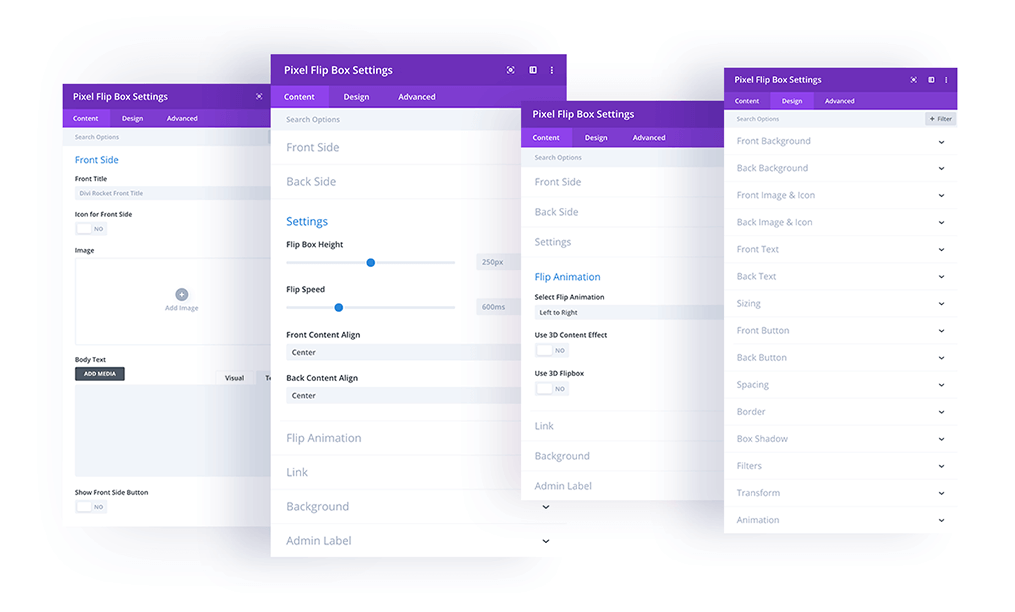
Content → Front Side/Back Side
In this section you can add the Title, Image or Icon, Body Text, and enable/disable the Button on the front and back of the module.
Content → Settings
In this tab you can define the height, animation speed, and content alignment on the front and/or back to either Left, Center, or Right.
Content → Flip Animation
The Flip Animation settings are a core part of this module. Here you can select the animation direction, add 3D Content Effects, or enable a 3D Flipbox Effect.
Design
In the Design Tab you’ll find customization options for all the Flip Box elements, as well as the usual default Divi module settings.
Front Background – Add background color or image to the front
Back Background – Add background color or image to the back
Front Image/Icon – Customize the front image or icon
Back Image/Icon – Customize the back image or icon
Front Text – Customize the front text (title & description)
Back Text – Customize the back text (title & description)
Front Button – Customize the front button
Back Button – customize the back button
Typing Text
The Typing Text module allows you to add catchy text animations on your website. You can add animated text as well as non-animated prefix and suffix text – and each of them can be easily customized in the Design tab. Create stunning text effects to make your website more dynamic!
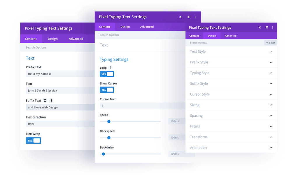
Content → Text
In this section you can manage the text displayed within the module. If you want to type multiple sentences, simply use the pipe “|” character to separate them.
You can also add Prefix Text, Suffix Text, Cursor Text, and switch the Flex Direction to Row or Column.
Content → Typing Settings
Here you’ll find all the core settings for the typing text effect. You can enable the Loop option, Show/Hide Typing Text Cursor, set the animation speed, back speed, and back animation delay.
Design
In the Design Tab you’ll find the customization options for all of the Typing Text module elements, as well as the default Divi module settings.
Text Style – General settings for all texts
Prefix Style – Customize Prefix text
Typing Style – Customize Typing Text style
Suffix Style – Customize Suffix text style
Cursor Style – Customize Cursor style
Star Rating
Easily add Star Ratings to your Divi website! This module is very flexible, and allows you to add and customize star ratings on any page. It comes with plenty of useful settings, like a star rating scale, so you can define your own scale, whether it be 3, 5, 10 or more. It also allows you to add decimal values, switch the Display Type (Block/Inline) and show the rating number. All these elements can be easily customized in the Design tab.
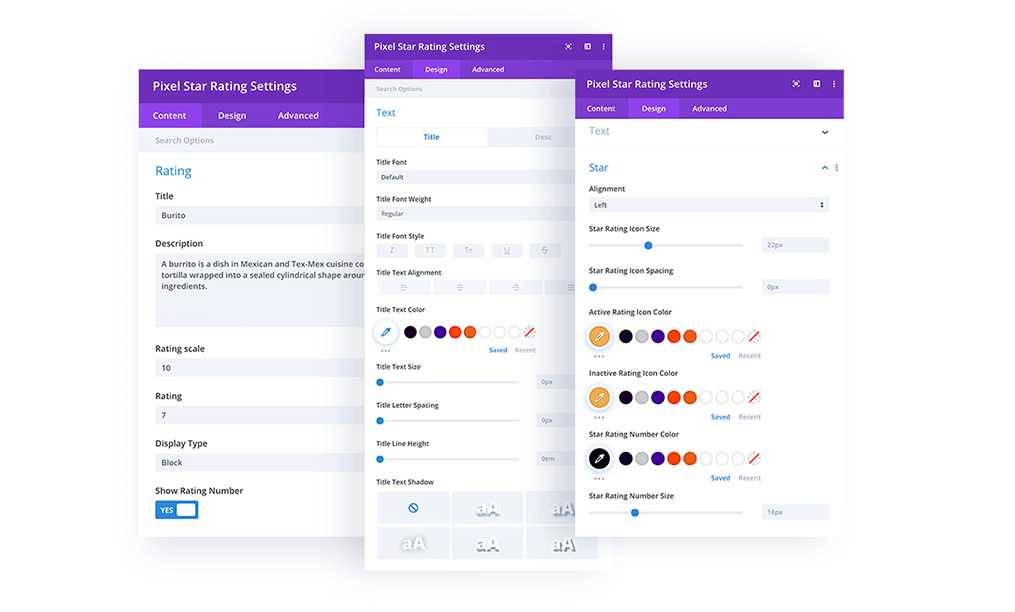
Content → Rating
In this section you can add the Title, Description, Rating Scale, and Rating, select the Display Type (block/inline) and enable/disable the Rating Number. The best part: you can pull the rating scale and the rating dynamically from custom post fields.
Design Settings
In the Design settings you can customize each Star Rating module element.
Text – Customize the Title and Description text.
Star – Customize the Star Rating style – change alignment, size, icon spacing, color and more.
Button Grid
Have you ever wanted to add more than 1 or 2 buttons in a Divi Section? With Divi Pixel it’s now possible! The Button Grid module allows you to add as many buttons as you like in a row or column direction. Each button can be customized independently in the Design tab. But that’s not all. You can also alter the Buttons and plain text. What would normally involve very complicated CSS is now as simple as pie.
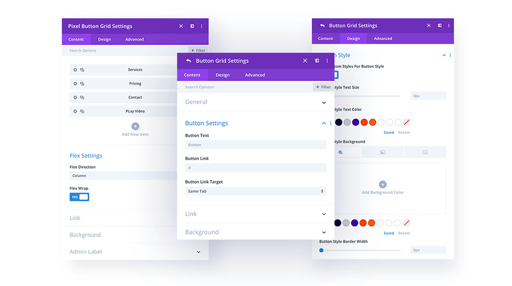
Content
In the (main) parent module, you can add Button or Text elements.
Content → Flex Settings
Choose the display direction via the Flex Direction setting. You can display the child items in rows or columns. Here you can also enable flex wrapping.
Content → Button Settings (child module)
This is where you add the Button Text and URL, and select if the link should be opened in the same window or in a new window.
Design → Text Style (child module)
If you choose to display Text in the child module, then the text styles can be customized in the Design/Text Style toggle.
Design → Button Style (child module)
If you choose to display a Button in the child module, then the button styles can be customized in the Design/Button Style toggle.
Carousel
With Divi Pixel you can easily create beautiful carousel sections in Divi. You can use the default elements, like Icons, Title Text, Descriptions, and Buttons, or you can select Divi Library items to be displayed in the carousel module. This creates virtually unlimited possibilities. In other words, with the Pixel Carousel module you can slide anything!
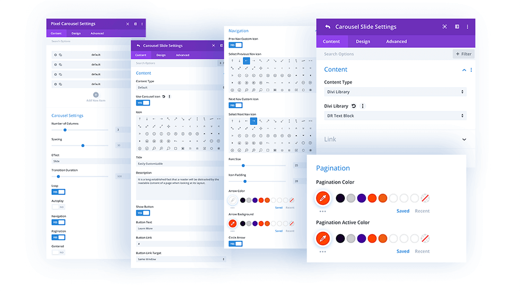
Content
In the (main) parent module, you can add carousel elements.
Content → Carousel Settings
Carousel Settings allow you to tweak the Number of Columns, Spacing between carousel items, and select effect (Slide/Coverflow).
You can also enable Loop, Autoplay, Navigation, and Pagination, and center the slider. All of these elements can be customized in the Design tab.
Design → Carousel Text
If you use the default item, you can customize the Title Text and the Description Text in the Design/Carousel Text tab.
Design → Carousel Item
In this section, you can customize the Carousel Item’s appearance, and tweak borders and box shadows globally.
Design → Navigation
Here you can customize the navigation by changing the Next and Prev icons, size, spacing, and color.
Design → Pagination
Here you can customize the navigation by changing icons, sizes, spacing, icon colors and backgrounds. You can also select if the navigation should be square or circlular.
Design → Button
If you use the default layout and add buttons, you can customize the button style here.
Content → Content (child module)
Once you add modules to the carousel, you can select if they should be the default items (with icon, title, description and button) or Divi Library Items.
If the Divi Library Item is selected, you can upload any Divi Library item saved to the Divi Library, and display it in the Carousel module.
Masonry Gallery
The Masonry Gallery module allows you to create amazing galleries! Its powerful options make it easy to create beautiful mosaic galleries with lightbox effects. Its advanced design settings allow you to fully style this module to your liking, and to change the thumbnail sizes for super-fast loading.
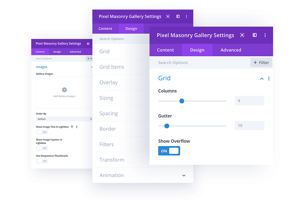
Content → Images
Gallery Images – Add the gallery images you want to display.
Order By – Select the ordering of the gallery images.
Show Image Title in Lightbox – Enable this option to show the image title in a lightbox when an image is clicked.
Show Image Caption in Lightbox – Enable this option to show the image caption in the lightbox when an image is clicked
Use Responsive Thumbnails – Enable this option to use responsive gallery image thumbnails. This will allow you to choose custom image sizes for desktop, tablet, and mobile thumbnails. You can perfectly match the column width and greatly speed up loading times.
Design → Grid
Columns – Select how many columns the module should display. Use the responsive toggle to display a different amount of columns on desktops, tablets, and mobile.
Gutter – Define the spacing between images.
Show Overflow – Enable this option to show overflow. This is useful if you want to have drop shadows on the images.
Design → Grid Items
Border Options – Customize the gallery items borders.
Box Shadow Options – Customize the gallery item box shadow
Pixel Counter
With Divi Pixel you can display counters in a more effective and attractive way. This module allows you to easily count numbers, dates, and even posts. You can add prefix and postfix text, as well as format the numbers to show a decimal value. Each Pixel Counter element can be customized in the Design tab. One of the unique options in this module is the Scale Style, which allows you to add a scale to your circular counters.
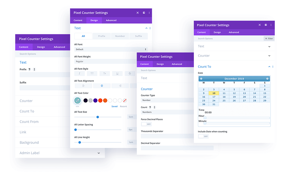
Content → Text
In this toggle you can add Prefix and Suffix text. Perfect if, for example, you’d like to count currencies, percentages, or anything else that might need a bit more explanation.
Content → Counter
The Counter toggle allows you to define the Counter Type (Number/Circle) and what to Count (Numbers/Dates/Posts). You can also enable Decimal Places and Separators, in case you want to use something different.
Content → Count To
In this toggle you can define the number, date, or select the posts or pages to be counted
Content → Count From
If the Count Numbers setting is selected, you can define the number from which the counter will start counting.
Design Settings
On the Design tab you can customize all of the module elements.
Counter – Set up the animation duration for the counter.
Circle – If Circle style is selected, you can customize it in the Design / Circle toggle. You can change line colors, line width, line cap, and enable the Scale. The number of lines of the scale cannot be changed. This is a limitation in Divi’s core code.
Text – Customize all Counter text (prefix, counter number, and suffix).
Tilt Image
Tilt Image is another module that will help you display content on your website in a more interactive and engaging way. This module offers a tilt effect on hover, including a 3D Content Effect which makes the module really stand out! In the module settings, you can add an Image or Icon, Title Text, Description Text, and a Button. Each of these items can be enabled or disabled.
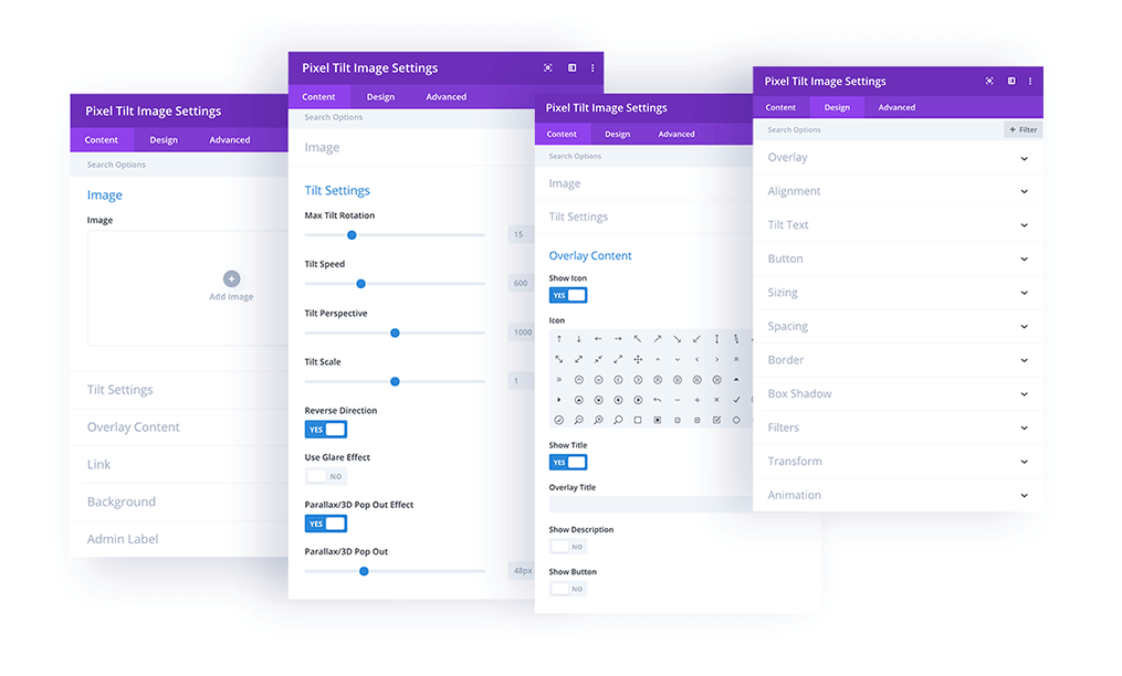
Content → Image
In this section you can add the image or icon for the module.
Content → Tilt Settings
Tilt Settings allow you to customize the tilt effect animation. You can customize Max Tilt Rotation, Tilt Speed, Tilt Perspective, and Tilt Scale. There are also 3 other powerful settings available. You can enable Reverse Direction, use a Glare Effect, and enable the Parallax/3D Pop Out Effect for Tilt Image content.
Content → Overlay Content
In this toggle you can add all the content that will be displayed in the module. Each element can be enabled or disabled individually.
Design Settings
In Design settings you can customize the style of all the different elements in the module.
Overlay – Add an overlay to the Tilt Image to make your text easily readable on any background.
Alignment – Define the Tilt Image content alignment (Left/Center/Right).
Image/Icon – Customize the Image or Icon
Tilt Text – Customize the Title Text and Description Text
Button – customize the Tilt Image Button.
Breadcrumbs
Adding Breadcrumbs to your site will not only improve overall site navigation and the user experience, but it’s also good for SEO. This module allows you to easily include Breadcrumb navigation on any page, and customize it to fit your website’s style and company branding.
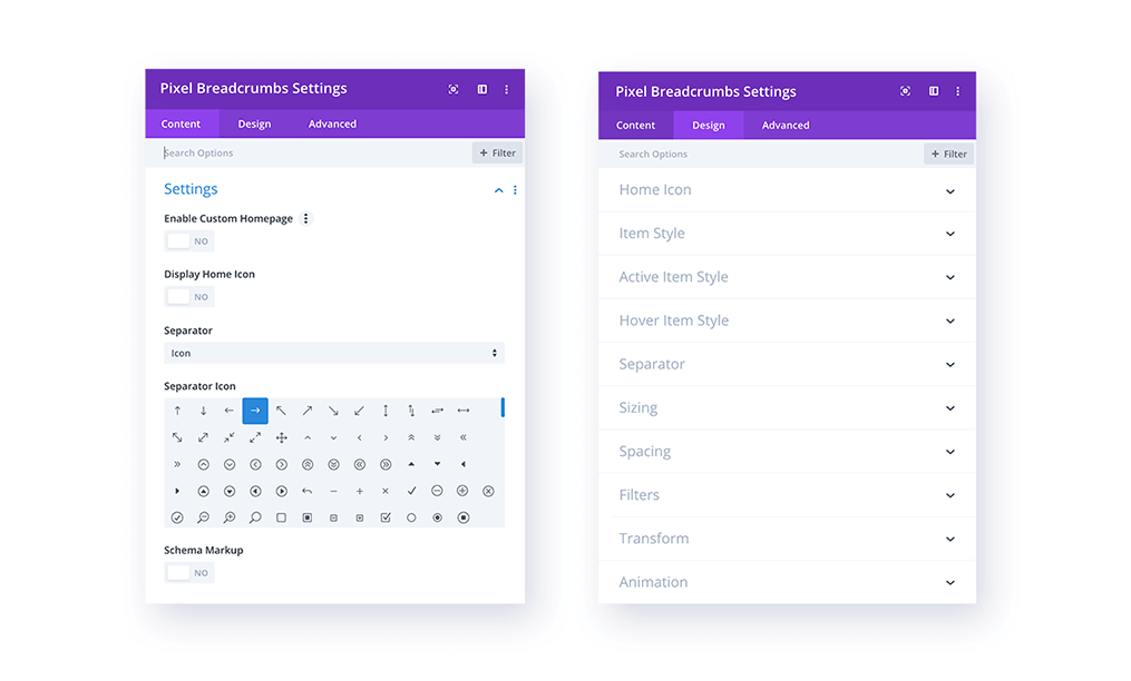
Content → Settings
In this section you can Enable Custom Homepage with custom text and link, Enable Homepage Icon, select the Breadcrumb Separator, and enable Schema Markup.
Design Settings
In the Design settings you can customize each breadcrumb element.
Home Icon – Customize the Home Icon color (default/hover/active) and size.
Item Style – Customize the breadcrumb style. You can tweak the font, color, box background, padding, border, box shadow, and more.
Active Item Style – Customize the active breadcrumb style.
Hover Item Style – Customize the Breadcrumb style on hover.
Separator – Customize the Breadcrumb separator.
Floating Images
The Floating Images module is an advanced module that will add some movement to your website. It allows you to add multiple images with animations, and each image has its own settings for position and animation. This module is responsive and looks great on all devices.
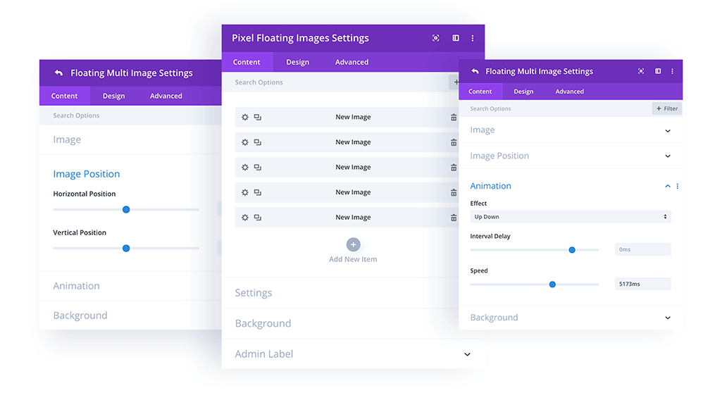
Content
In the (main) parent module you can add images as child modules.
Content → Settings
In this toggle, you can define the module’s total height.
Content → Image Position (child module)
In this toggle you can set the position of the image.
Content → Animation (child module)
Here you can define the image animation (Up-Down/Left-Right), the animation interval delay, and the animation speed.
Testimonial Slider
This is the most advanced module in Divi Pixel, and the first module of its kind available to the Divi community. Our Testimonial Slider integrates with Facebook and Google pages. All you need to do is to add page ID’s and access credentials for your Facebook and Google pages, and fetched testimonials can be easily displayed as a slider. You can also add testimonials manually, and display WooCommerce testimonials. This module is highly customizable, and allows you to style the testimonials displayed on your site in a very accessible and intuitive way.
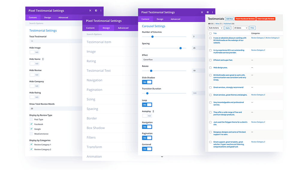
Content → Testimonial Settings
In this section you can set the following settings:
Total Testimonial – The number of testimonials displayed within the module.
Hide specific elements – Image, name, review text, company name, and rating.
Testimonial Length – Set the number of testimonial words displayed.
Display by Review Type – Select what types of testimonials will be displayed in the Testimonials module.
Display by Categories – Categorize testimonials and display testimonials from only specific categories.
Content → Carousel Settings
In this section you can customize these slider settings:
Number of Columns – Define the number of columns for desktop, tablet, and mobile.
Spacing – Set the spacing between testimonial boxes.
Effect – Select the default grid slider or Coverflow effect.
Rotate – Set the angle for Coverflow 3D effects.
Slide Shadow – Enable or disable slide testimonials shadow.
Transition Duration – Set transition duration for the slider.
Loop – Enable testimonial looping.
Autoplay – Enable Autoplay for the Testimonial Slider.
Navigation – Enable or disable arrow navigation for the slider.
Pagination – Enable or disable pagination navigation.
Centered – Center the carousel slider.
Design → Testimonial Item
In this section you can customize the look of a single testimonial box. You can select text alignment, slide box shadow for the Coverflow 3D effect, set padding, and background color/gradient and image.
Design → Image
In this tab you can customize testimonial profile images.
Design → Rating
Here you can customize the appearance of star ratings if enabled by changing the color, size, and star spacing.
Design → Testimonial Text
In this tab you can customize the testimonial’s text: name, review text, and company.
Design → Navigation
In the Navigation tab you can customize the arrow navigation by changing the icon, icon size, position, make it boxed or circular, tweak the icon box padding, and more.
Design → Pagination
In the Pagination section you can customize the dot navigation position and colors for active and inactive dots.
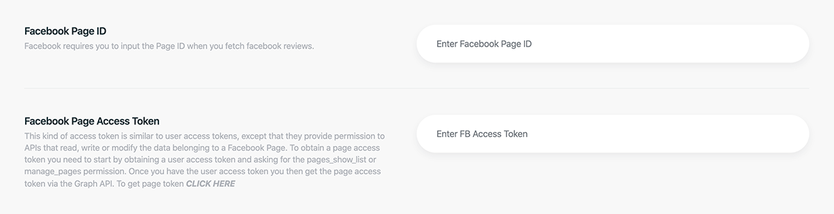
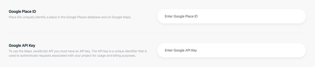
Integrate Facebook Reviews
The Testimonial Slider module allows you to display Facebook and Google reviews by adding access credentials for each to make them work.
For Facebook integration, you need to add a Facebook Page ID and Access Token.
You can find out how to get a Facebook page ID here.
The Access Token can be generated here.
All access credentials should be added under Divi → Divi Pixel → Settings
Price List
The Price List module has been developed to help you easily display price lists on Divi websites. This module is a great addition for restaurants, cafes, and bistro websites (and many more) as it can be used for displaying any items where a list view is required. You can add an item image, title, price, and description. Each element can be fully customized to fit your company’s brand, color scheme, and style.
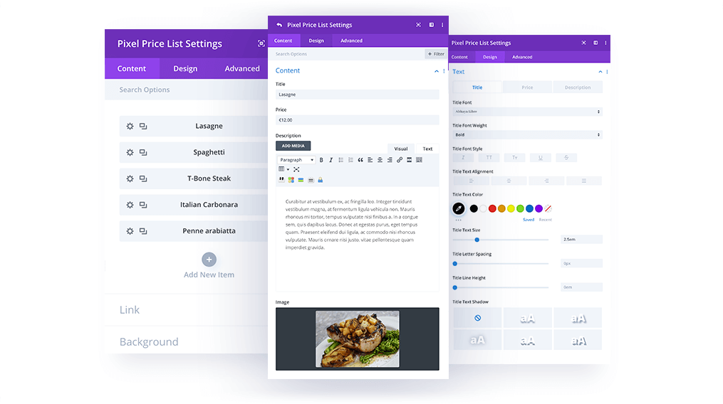
Content
In the main Content tab you can add price list items as child modules.
Design → Layout
In this tab you can control the Price List title and Image alignment. For these elements, the following settings are available:
Center – Define the number of columns for desktop, tablet, and mobile.
Flex Start – Set the spacing between testimonial boxes.
Flex End – Select the default grid slider or Coverflow effect.
Baseline – Set the angle for Coverflow 3D effects.
Design → Image
In this section you can customize the price list item images. You can set image spacing, image width, add rounded corners, borders, and shadows.
Design → Separator
The Price List module allows you to use separators between the Title and Price. This separator can be customized by selecting the separator style, weight, color, and spacing.
Design → Text
In this tab you can customize the Price List text: title, description text, and price.
Image Hotspot
The Image Hotspot module allows for easily creating an interactive image. You can select a background image, and place multiple hotspots on it, such that on hover, a tooltip box appears with additional details. You can use default items for the tooltip box, or Divi Library items. Default item features include image/icon, title, description, and button, and each of these elements is fully customizable.
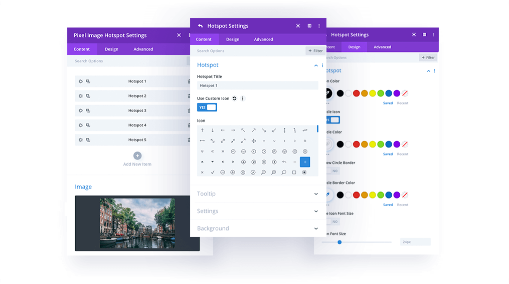
Content
In the main Content tab you can add price list items as a child modules.
Hotspot Settings → Content → Hotspot
Each hotspot has separate settings. In the Hotspot tab, you can add the hotspot label and choose an icon or image.
Hotspot Settings → Content → Tooltip
In this section you can choose to display default tooltip elements or Divi Library items. If you select Default Content Type, you can add tooltip images or icons, titles, descriptions, and buttons.
Hotspot Settings → Settings
In this section you will find the following positioning and sizing settings:
Hotspot Position Vertical
Hotspot Position Horizontal
Tooltip Position – Left, Right, Top, Bottom
Tooltip Width
Tooltip Content Alignment
Use Tooltip Arrow
Hotspot Settings → Design → Hotspot
In this tab you can customize the tooltip icon or image by making it circular, adding borders and shadows, changing the colors, and selecting the hotspot icon/image size.
Hotspot Settings → Design → Hotspot Ripple Effect
To make hotspots even more interactive, we’ve added a Ripple Effect, which can be enabled or disabled. If enabled, you can control the pulsing effect color.
Hotspot Settings → Design → Tooltip Image
This section allows you to customize the tooltip image. You can define the image size, add rounded corners, borders, and image shadows.
Hotspot Settings → Design → Tooltip Box
In this tab, you can customize the tooltip box appearance and change the background color, add tooltip box padding, rounded corners, borders, and box shadows.
Hotspot Settings → Design → Tooltip Text
In this tab you can customize the Tooltip text: title and description.
Hotspot Settings → Design → Tooltip Button
By enabling this button in the tooltip, you can customize it in the Tooltip Button section, where all the default Divi button customization options are available.
Countdown Timer
The Pixel Countdown module makes creating countdown timers a breeze. It offers 3 types of dates, and 3 unique styles to select from, which can be further customized as desired. One of the styles is an amazing Flip Clock which will give your countdown timer an exciting retro feel. Another useful feature is Event settings, in which you can choose what action will be taken after the countdown module finishes. You can continue, stop the clock, forward to a URL, stop and execute a JavaScript, or stop and replace the timer with HTML code.
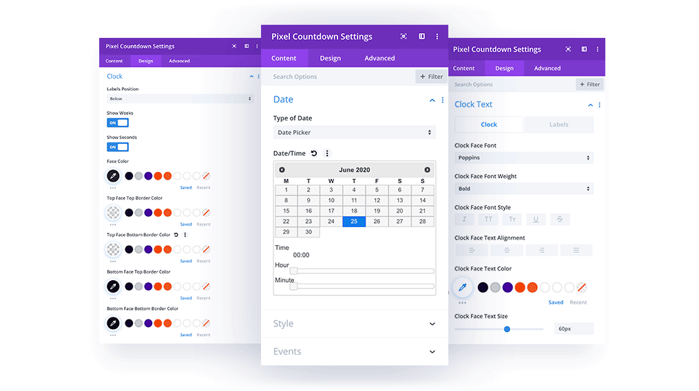
Content → Date
In this tab you have 3 options to select:
Date Picker
Text
Current Time + Offset
Content → Style
In this section you can select the countdown clock style. There are 3 styles available:
Block Clock
Flip Clock
Custom Format
Design → Clock Text
In this tab you can customize the countdown module Clock and Label text.
Design → Clock
This section allows customizing the clock style. You can choose which elements will be displayed (weeks, days, hours, minutes, or seconds). You can also select the label position, change the clock colors, width, height, and set the Face Clock margins.
Lables Position – Above/Below
Face Color
Top Face Top Border Color
Top Face Bottom Border Color
Bottom Face Top Border Color
Bottom Face Bottom Border Color
Face Width
Face Height
Face Margin
Hover Box
The Pixel Hover Box module has been developed to dynamically display your content with an attention-grabbing presentation. You can add default and hover elements in the module settings, so the card will display different content on mouseover. You can add Images/Icons, Titles, Descriptions, and Buttons for both the default and hover states, and display hover content with a silky-smooth animation. The module comes with 6 animations, so you can be assured that there will be a style that will meet your needs.
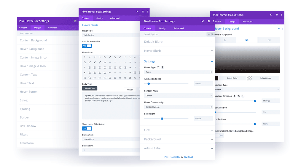
Content
In the Content tab you can add Default/Hover content, select animation style and speed, define the content alignment for both cards, and set the Box Height.
Content → Default Blurb
In this section you can add the content that will be displayed by default.
Icon/Image
Title
Description
Content → Hover Blurb
In this tab you can add the content that will be displayed on mouseover.
Icon/Image
Title
Description
Button
Content → Settings
In the Settings tab, you can select Hover Animation, Speed, Content Alignment, and Box Height.
Hover Type:
Slide – Bottom to Top, Top to Bottom, Left to Right, Right to Left
Fade
Zoom
Animation Speed
Content Align/Hover Content Align: Top Left, Center Top, Top Right, Left, Center, Right, Bottom Left, Center Bottom, Bottom Right
Box Height
Design → Content Background
In Content Background you can set the default blurb background adding solid color, gradient, or an image.
Design → Hover Background
In the Hover Background tab you can set the background for the hover blurb, and add solid colors, gradients, or images.
Content → Image & Icon
The Content Image & Icon tab allows the customization of the icon or image selected for the default blurb, allowing tweaking of borders, and adding shadows.
Content → Hover Image & Icon
The Hover Image & Icon tab allows customizing of the icon or image selected for the default blurb. You can tweak borders, and add shadows.
Content → Content Text
In this tab you can customize the title and description text.
Content → Hover Text
In this tab you can customize the title and description text on the hover card.
Content → Hover Button
In this section you can style the button on the hover card.
Blog Slider
Blog Slider module is a perfect way to showcase your blog posts in a sliding form. You can customize a number of columns that will be displayed for desktops, tablets and mobiles. The module offers many customization options. We can select what elements in the blog post box will be displayed and what not. We can add a nice hover animation for the blog post image, customize navigation, date ribbon, read more button, all texts and more!
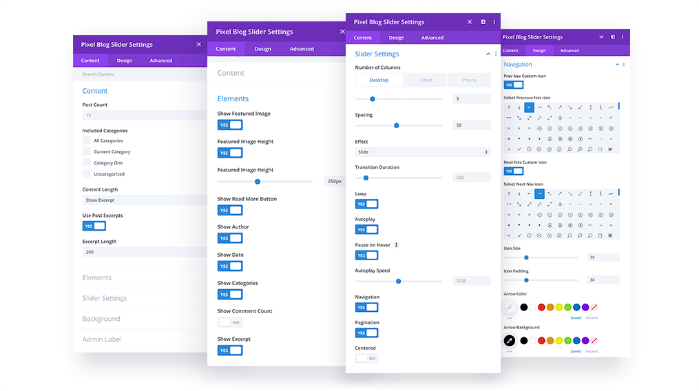
Content
In the Content tab, we can select how many posts will be displayed, select categories and control if the excerpt text should be displayed. If it’s enabled, we can also define how long excerpt text should be.
Content → Elements
In Elements tab we can select what elements will be displayed for our slider blog posts. We can Enable/Disable the following elements:
Featured Image
Define Featured Image Height
Read More Button
Author
Date
Categories
Comments
Excerpt
Content → Slider Settings
In this tab we can customize how our Blog Slider will look like. We can select columns for desktops, tablets and mobiles, define spacing between blog post boxes, select effect, enable navigation and more. Here is a list of all available options:
Number of Columns
Spacing
Effect (Slide/Coverflow)
Transition Duration
Loop
Autoplay
Pause on Hover
Autoplay Speed
Navigation
Pagination
Centered
Design → Image
In Design tab tab we will find 7 custom tabs with options that will help us customize the design of our Blog Slider module. First tab is an Image. We can select image animation on hover and add image overlay background for the default and hover state.
Image Animations:
None
Zoom In
Zoom Out
Rotate
Design → Blog Item
Blog Item tab allows us to customize the look of our single blog post box. We can add background, border and box shadow.
Design → Blog Texts
In Blog Texts we have tabbed area with text customization options for title, description, category and author.
Design → Blog Date
The Pixel Blog Slider offers custom design. We have separated date from meta text and placed it in the right corner. We can display square or circle ribbon with date. We can also change spcaing, date fonts and ribbon colors.
Design → Navigation
If we enable Arrow Navigation for our Blog Slider, then we can customize its look in Design/Navigation tab. We can select icons for left and right arrow, tweak positioning, define icon size, colors, make the arrows circle and tweak spacing.
Design → Pagination
In Pagination tab we can select color for active and not active pagination bullets. We can also tweak Pagination Navigation position.
Design → Read More
In Read More tab we can enable custom style for our Read More button where all default Divi button customization options are available. Additionally, like all other elements, we have added options for position, so the button can be aligned to the left, center or right.
Fancy Text
The Fancy Text module allows you creating animated headings by using texts that change with a nice animation. You can take any text and rotate it with different phrases so you can create attractive headings for your Divi site. The module allows adding as many texts as you want and style them independently. You can also select animations IN and OUT for how the texts come in and how they go out.

Content
In the Content tab, we can add child modules with each text phrase we want to display within the module.
Content → Text
The Fancy Text module allows adding a prefix and suffix text in addition to our animated texts. You can also select if those texts will be displayed horizontally or vertically.
Content → Animation
In this tab, you can select what animation you want to use. You can apply different settings for Animation In and Out and also define Delay and Animation Duration.
Design → Text
Here you can customize each child module text independently. You can change text font, color, size, letter spacing, add text-shadow and more!
Accordion Image
Accordion Image module is another module that will help you display the image galleries with content in a nice and interactive way. You can add icon, title, description and button to each image added and reveal that content on hover or after the image is clicked. The module allows adding image overlay for default state and on hover which makes it, even more, user friendly. It’s a great addition to any website that utilizes images, so rather than displaying static images, we can show them in a nice accordion-style section.

Content
In the Content tab, we can add child modules with images we want to display within the module.
Content → Settings
In this tab, we have several options for our Accordion Module. We can select when each image will reveal content (On Click or On Hover), define Accordion Direction for each device (Horizontal or Vertical, and control height of our module.
Child Module → Content → Background Image
Each child theme module features Background Image upload field where we can add image for our Accordion Module.
Child Module → Content → Accordion
Here we can customize each child module content independently. We can add an icon, title text, description and button. We can also select tab to be active/opened on load.
Child Module → Design → Image Overlay
In this tab, we can add Image Overlay for our image. It also supports hover state, so if we select to open tabs on click, it’s a great idea to add hover overlay to let users know there is something else to see.
Child Module → Design → Accordion Image/Icon
Customize image or icon. Define width, select icon color, display circle icon, add a border and select icon size.
Child Module → Design → Accordion Text
This tab is divided into 2 sections where we can style our title and description text.
Child Module → Design → Button
Customize Accordion Image Button – select colors, font, size etc.
Scroll Image
With the Scroll Image module, you can easily add scrolling effect on images & make the website interactive enough to influence your visitors engage. This module comes with a bunch of powerful settings and is highly customizable. You can select scroll direction and when the image will be scrolled (on hover or using mouse scroll), set image height, define scroll speeds, add image overlay and icon with animation that will indicate users to hover on the image to see the full content.

Content → Image
In the Content tab, we can add image, image alt text and set the image height.
Content → Settings
In this tab, we have a bunch of settings available for our Scrolling Image module. We can select when the image should be scrolled (on hover or using mouse scroll), select scroll direction (Horizontal/Vertical) and use Reverse Direction function that will determine if the image will be scrolled from the left to the right or right to left, bottom to top or top to bottom.
We can also define Scroll Speed and there are 2 controls available for that feature. We can set scroll speed for hover, and we can tweak how fast the image will scroll back to the default position after the mouse is taken out.
We can enable Image Overlay which can be tweaked in Design/Overlay. This feature has hover option, so we can add Image Overlay for the default card, and change it or remove when the image is not active.
The last option is the Direction icon. We can add icon that will be displayed on not active image. We can select icon using Divi icons library, or upload our own icon that will represent scrolling feature. We can also enable Icon Animation. If we have vertical scroll selected then the icon will animate (bounce) vertically, and when horizontal scroll direction is selected, then the icon will bounce horizontally.
Design → Direction Icon
Here we can customize the direction icon. We can change colors, add circle icon, border and set the size for our icon.
Design → Overlay
If we enable Image Overlay in Scroll Image module settings, then we can tweak its settings in this tab. We can set image overlay for the default image, and for the image when we mouseover.
Other Design Settings
In the Design tab, we can also customize border and box-shadow, add filters and use all other Divi native features.
Panorama
Scrolling panoramas allow you to display a wide or tall image in a small space. Instead of reducing its size to fit on the screen, you can place the image in a scrolling panorama, which will allow you to see a larger image at its actual size. The visitor can view the entire image by dragging it horizontally or vertically, depending on settings selected. This module also supports 360° videos and it will be a great addition to any website in the travel industry.
Pixel Panorama comes with 4 modes: 2D Image, Equirectangular, Cube Map and Video Panorama. Each mode offers different settings.

2D Image
2D Image Panorama allows you to upload a simple 2D image and let users drag the image to scroll horizontally and/or vertically to reveal a full content. In this mode, we can select Scroll Direction (Horizontal, Vertical, Both) and define Repeat option (None, Both, Horizontal or Vertical). Each panorama mode comes with Overlay settings, so you can add an image overlay and it will fade out smoothly when the user starts interacting with the image.
Equirectangular
The Equirectangular mode is a real 360 degrees panorama. It’s a single rectangular image that wraps 360 degrees horizontally and 180 degrees vertically. In this mode, the image will get rounded into a sphere and will repeat horizontally automatically. The entire panorama image won’t load on frontend by default. User can load Panorama by clicking “Click to Load Panorama” button displayed on the module. You can upload a huge panorama image to give users even better user experience and do not harm your website load speed. We can enable Auto Load settings in the module settings. You can also add overlay background and style the module as any other Divi module by adjusting settings available in the Design tab.

Cube Map
In the Cube Map mode, the environment is projected onto the sides of a cube and stored as six square textures. There are many tools online which will allow you to generate Cube Map from the equirectangular image. One of the tools can be found here.
To create Cube Map visit the page mentioned above and upload the equirectangular image with ratio 2:1. This online tool will create a cube map with all images needed to display a nice panorama using this mode.

Once the cube map is generated, you can download all images and upload to the Pixel Panorama module with the Cube Map mode selected.
It’s crucial to upload images in the proper order (see image below).

Video Panorama
Video Panorama mode allows you to upload 360° panorama videos. There are very few situations when creating a 360° video is actually “necessary”. But there are opportunities when it’s useful — for example, if you’re trying to create an amplified, but virtual experience of a certain place. That could be why many of the most popular 360° videos pertain to travel or exceptional experiences. Those are the types of situations that are enhanced by this particular video format.
This mode allows you to upload panorama video or insert a link from YouTube.
Reading Progress Bar
Reading Progress Bar can be very advantageous for your website as it is capable of immediately grabbing visitors attention. It gives the audience progressive reading feedback in terms of how far he or she progressed reading a specific page. As a result, people feel encouraged to scroll through the whole article. This is why you should implement a Reading Progress Bar on your site and boost the engagement rate. The Reading Progress Bar can be placed on the top, below the menu or at the bottom of your website. We can also change its color, width and even add animation.

Bar Display Position
The Reading Progress Bar can be injected in 3 places. You can select to display it at the top of the page (above header), below header and at the bottom of the page.
Animation
By default, bar animation is disabled, but if you want to add striped animation to the module, you can enable that in Animation dropdown.
Design Settings
In Design/Bar you can customize the design of your Reading Progress Bar. You can define the background color, bar color and 2nd color for the bar when striped animation is enabled. You can also tweak the bar size using Bar Size slider.
Image Magnifier
Image Magnifier allows you to add image and use a magnifying glass to have it zoomed, so the user can see the image in high resolution. This module will be extremely useful for displaying images on the product pages and more. You can upload an image which will be displayed in a magnifying glass on mouseover. There are options for customizing Lens Size, Speed and Lens Style. Image Magnifier also offers all settings available natively in Divi, like box-shadow, border, filters, sizing, spacing etc.

Image Settings
In the Image tab, you can upload image which will be zoomed in the magnifying glass. You can also add Alt Text that will be included in the source code and will improve your SEO.
Settings
In the Settings tab, you will find 2 options. Lens Speed will define how quick the Magnifying Glass shows up on hover, and how quick it disappears after taking the mouse out. Lens Size defines the size of the magnifying glass.
Lens Style
You can customize Lens Style in the Design tab. You can edit the border size, color and add lens inner shadow.
Lottie Icon
Lottie Icon is one of the most anticipated modules by Divi users. It allows you to create beautiful blurbs with animated icons. This module is nothing else like a Blurb module, but instead of Icon/Image, you can upload animated icon in .json file. The animated icon can be found on the official Lottie Files Website. The animation can be customized. You can tweak animation speed, enable autoplay, start/stop on hover and more!

Content
In the Content tab, you can upload the .json file with an animated icon, add title, description and button. Each element can be customized in the Design section. The Lottie Icon can be downloaded from the official Lottie Files Website.
Settings
In Lottie Icon Settings tab you can customize icon animation. There are 6 controls available. You can enable Loop, Autoplay, Start/Stop on hover, select Start Frame, define animation speed and select animation direction.
Design Settings
In Design settings you will find Lottie tab where you can change content alignment and tweak Lottie Icon Width. In the Text tab, you can customize title and description added to the Lottie Icon module, and in the Button tab, you can tweak button design. There are also native Divi settings available like border, box-shadow, sizing, spacing, filters etc.
Image Showcase
Image Showcase module allows you to display images on devices. It’s an excellent module for showcasing your web design work in a beautiful way. There are 15 device mockups available. This module also allows you to upload multiple images and have them displayed on the device you have selected in a slider form. You can enable Loop and Autoplay options, control slider speed and duration and select animation type (Fade, Slider & Coverflow effect).

Content
In the Content tab, you can upload an image or multiple images. Each image child module has 3 controls: Label, Upload Image and Image Alt Text where we can add image title for SEO purposes.
Image Showcase Settings
In this tab, you can select the device you want to use for your Image Showcase module. You can select 1 of 15 device mockups where your uploaded images will be displayed. There are 4 devices available: desktop computer, laptop, tablet and 2 mobile phones (dark and white).

Carousel Settings
If you upload multiple images, then in this tab you can control your slider settings. You can select 1 of the 3 slide animations (Fade, Slide and Coverflow), tweak animation speed and duration, enable Autoplay and Loop option.
Image Mask
Fluid shapes have become one of the most used web design trends in the last decade and Image Mask module will help you display your images in a more attractive and sophisticated way. This module comes with 12 predefined shapes where you can wrap your images easily. Each shape has a custom border which can be enabled

Mask Settings
In Mask Settings tab you can upload the image, select the mask shape you want to use, define image size and position image so it is displayed well and fit the shape perfectly.

Border Layer
Border Layer is a custom border added to each mask. Once it’s enabled, we can control the color of the border by selecting a solid color or gradient.
Decoration Element 1 & 2
Image Mask module also allows you to add 2 additional layers which can be added to your shape image. You can change decorative element color, size, position and rotate the element to achieve a beautiful result. There are 15 shapes available.

Timeline Module
Timelines have always played an important role in websites that want to show the history, a process or something that has a stepwise procedure. The Divi Pixel Timeline module lets you create beautiful timelines on your website using the Divi Builder. This timeline module works similar to other Divi Pixel modules; you just need to add the module to your page and format it as per your requirements.

Content
Timeline module allows you to add as many timeline items as you want. Each item added has it’s own settings, so you can customize all items individually, or create and customize one item and then duplicate it to keep the same styling.
Card Arrow
In parent module settings we can add an arrow, that will be displayed on our card and point to the timeline icon. This arrow can be customized individually for each card in child module settings (Design/Card Arrow)
Layout
Parent module also offers Layout settings. We can select Mixed, Left or Right layout. If Mixed layout is selected, we can also define on which side our first card should appear (Left/Right). These settings are responsive, which means we can customize layout individually for desktop, tablet and mobile view.
Timeline Line
Our Timeline Line can be also customized in the parent module (Design/Timeline Line). Here we can find multiple settings which allow us to customize line width, color, style and Line Area Size, which will help us to set the proper spacing of the cards according to the Timeline Icon size defined.
Child / Card Text
In this section we can add Ribbon (year/date), Title, Description and enable Button.
Child / Card Image & Icon
We can also add Image or Icon to our card and customize it further in Design tab. If we want to display Image, then we can also add Alt Image Text for SEO purposes.
Child / Timeline Icon
Each card can have icon added, that will be displayed on our timeline. In this section, we can select the icon for the individual card. This icon can be customized in the Design tab.
Child / Design
In the design section, we can customize the look of our card. We will find multiple tabs here:
• Timeline Icon – icon color, circle icon, icon size
• Card Style – border-radius, border style, width, Box Shadow
• Card Arrow – arrow size and color
• Image/Icon – icon alignment, border radius, border width, style, color, box-shadow, filters
• Text – this is where timeline card texts can be customized
• Button – we can enabled custom style for button
• Sizing – define card size
• Spacing – here we can customize card spacing, add card margin/padding and tweak card content padding as well
Content Toggle
Showcasing content with a toggle switch is an excellent way to display lengthy and essential content concisely. With a toggle switch, you can provide site visitors with an opportunity to explore key information in a less-bulky, easy to interact, and engaging way. With the Divi Pixel Content Toggle module, you can easily create content with a variation. This module will be great for displaying pricing tables, comparing products or services, displaying before and after images and much more!

Toggle Settings
In Toggle Settings we have 4 options. We can add titles for our toggles and select content from the Divi Library that will be displayed.
Content Animation
Divi Pixel Content Toggle provides unforgettable user experience. With Content Animation settings we can control how our content shows up on the screen after the toggle is switched. We can select one of the 19 beautiful animations, control delay and speed to .make sure that content will switch smoothly
Recent Comments