How to create Mega Menu in Divi with Balloon Module

By using the built-in Divi Pixel feature, you can build a mega menu and display it in the navigation instead of the Divi native dropdown menu. Mega menus are very popular in web design today. They will be especially useful if your menu is complex and has many links, which would make navigating the page difficult if we used the standard menu dropdown.
In this tutorial, I’ll show you how to build and implement a mega menu on your Divi site. We will use the Divi Pixel Balloon module for this, which allows you to display info boxes, balloons and various tooltips when you hover the mouse over an element.
We also have a freebie for you. To speed things up, we’ve created mega menu layout that you can download, import into your Divi library, and use on your own website in no time.


Build Mega Menu layout using Divi Builder
The first thing we need to do is design our mega menu using the Divi builder. To use a previously designed layout, it must be in the Divi library. There are 2 ways to save a layout to the Divi library. We can save the layout from any page or just add a new layout directly in the Divi library.
For this tutorial, we’ll use the second d method. I’ll show you how to add a section, row or module to your Divi library, and then use it to create a mega menu on your Divi site.
Note: If you want to use our prebuilt Mega Menu Layout Pack, you can skip this step, and just import Mega Menu Layout Pack to your Divi Library.
- In your WP Dashboard navigate to Divi → Divi Library
- Click Add New button
- In the modal window add Layout Name and select Layout Type. For most scenarios, a row will be fine, but if you need to build more complex mega menu layout, you can choose section.
- Click Submit

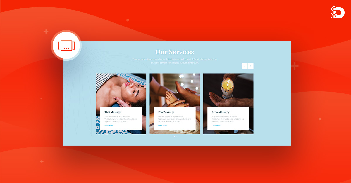
- Now only the sky is the limit. Design your own mega menu using the Divi builder module. For creating my demo layout, I have used 2 columns layout 2/3 + 1/3 and Divi Text and Blurb modules.
- Once you are done, click the Save button to save your new mega menu layout.

Important notes
By default, the Divi row is set to be 80% width. This will create unwanted spacing on sides when we will use it in the Balloon module. For Balloon use, row width should be set to 100% (Design → Sizing).
Divi row has also default padding added. If you don’t want to retain any spacing in the row, set padding to 0px in the row settings (Design → Spacing).
Add Globar Header with Balloon module
In this step, we will add a global header using the Divi Theme Builder and configure our mega menu using the Divi Pixel Balloon module. For the header, we will use 1 column in which we will place the Divi Menu module. Then we’ll add the Balloon module below, and call the new mega menu layout that we have saved in the Divi library.
Add Global Header using Divi Theme Builder
- In your WP Dashboard navigate to Divi → Theme Builder.
- In the Default Website Template box, click Add Global Header and select the Build Global Header option.

- Click Add New Row and select 1 column layout.
- In the modal box search for Menu module and add it to your header layout.

Global Header Customization
Now that the Menu module is added, we can configure it. In the module options, you can add a logo, change the menu font, color, and change the menu alignment. There are more options out there, so browse them carefully to find a menu that suits your needs. I would like to mention the distances. By default, they won’t be consistent, because Divi adds some padding/margins to sections, rows and modules, so we need to tweak them to make our Divi Menu module perfectly centered in the header section.
Below is my configuration:
- In the Section settings, I added 0 for top and bottom padding
- In Row settings, I set 20px bottom and top padding.
- In Menu module settings I removed bottom padding by adding 0px.

Add Divi Pixel Ballon module to the header section
In this step, we’re going to add the Balloon module and customize it so it just looks good. By default, the Balloon module has 550px width, so we need to increase it. We will also remove some spacing, set the selector, position and animation.
- Click Add New Module icon
- Search for Balloon and add it below the Menu module
- In Balloon module setting, add .dp-mega-menu to Selector field
- Select Balloon Placement to Bottom
- Choose Balloon Animation
- In the Content Type dropdown select the Divi Library option
- In Divi Library dropdown, select your saved Divi Library item

Balloon module Spacing and Sizing
- In the Balloon settings go to Design → Sizing
- Set your desired Balloon width. I added 1000px. Set max-width to 100%.
- Go to Spacing toggle
- Set Balloon Padding to 0 (optionally).
- Save header layout and quit Divi Builder.

Add desktop and mobile menu
In this step, we will add and configure a menu so that it displays our mega menu when you hover the mouse overspecific menu item. To do this, we need to add a custom class to the menu item. I’m also not a fan of using the mega menu on mobile devices, so we’re going to add a new, simplified menu to display on tablets and phones and I will show you how to do that.
- In your WP Dashboard navigate to Appearance → Menus
- In Screen Options make sure you have CSS Classes enabled
- Add dp-mega-menu class to the menu item you want to use for the mega menu dropdown
- Click Save Menu button

Add new menu for mobile devices
Now we will create a new menu that we will be displayed on tablets and mobile devices.
- In Appearance → Menus click create a new menu link.
- In the Menu Name field enter the name for your mobile menu
- Click Create Menu button

- Choose Mobile Menu for editing and click the Select button.
- Add pages you want to display in your mobile menu
- Click Save Menu button

Add Mobile Menu to the Theme Builder Header
The last thing we need to do is add the mobile menu to our header and hide our desktop menu on mobile devices, and the mobile menu on desktop computers. To achieve that we will add a new row to our Theme Builder Header and apply visibility settings to hide rows on specific devices.
- Navigate to Divi → Theme Builder
- Click the Edit icon located in the Global Header button.

- Add new Row below the Balloon module
- Select 1 column layout
- In the modal box type Menu and add Menu module to the new row

Select Menu for mobile devices and customize the spacing
In the new Menu module, we need to select a menu for mobile devices. We have created a separate menu for mobiles in the previous step, and now we need to choose this menu in the Menu module. We will also add 20px bottom and top padding for the Menu module, and tweak module paddings.
- Select Mobile Menu in Menu selector field
- Go to Design → Spacing and add 20px bottom and top padding
- Save Menu module settings

Setup Visibility settings for rows
We are nearly there! In this last step, we need to adjust Visibility settings and remove the padding from the row with our mobile menu.
- Open first row settings
- Go to Advanced → Visibility and select Phone and Tablet checkboxes.
- Open second row settings
- Go to Design → Spacing and set 0px top and bottom padding
- Got to Advanced → Visibility and select Desktop checkbox
- Save layout and quit Theme Builder

Improve user experience with Balloon module
As you can see, the Divi Pixel Balloon module is a very versatile tool. You can not only build mega menus with it but also all kinds of prompts. The Divi Pixel Balloon module lets you build tooltips using the Divi Builder and trigger them on any element you want. This module uses the tippy.js library and is a complete solution for popovers and dropdowns. It comes with an optimized positioning engine for flipping and overflow prevention.

This is it! I hope you enjoy reading this tutorial. Adding a mega menu to your Divi website is a great idea and can help your visitors navigate your site. Whenever you use custom code or 3rd party plugins for mega menus, make sure that your menu is optimised for mobile devices.

Maciej Ekstedt
Maciej, co-founder of Divi Pixel, is a passionate web designer and marketing expert who thrives on turning creative ideas into effective strategies. His fascination with the intricacies of megalopolises influences his work, where he meticulously crafts detailed solutions for his company.
Enhance your Divi Theme with Custom Settings and New Modules. Start Creating Awesome Websites with the Divi Pixel
We offer a 14 Day Money Back Guarantee, so joining is Risk-Free!
Hi,
The ballon module to create a mega menu is a good idea. Thanks for this.
But creating 2 menus (1 for mobile and 1 for desktop) will probably decrease the performance of your website. Both will be loaded anyway in the source code, isn’t it ?
Thanks for your reply.
No, I believe hidden elements are not loaded on the front end. There is actually no other way if you want to display a different menu on mobiles, which I strongly recommend, instead of using Mega Menu for mobile users.
Hello!
Is it possible to create the megamenu without using the theme generator to create a header?
Yes, if you don’t use Theme Builder for your header, then you have to place the Balloon module in the footer, so it’s loaded globally.
Hi! How do you apply a different mega menu for each menu header with the ballon module. Is it as simple as changing the CSS class name for each menu header?
Yes, just make sure the Balloon module is placed in the header or footer, so it’s available on all pages.
Is it possible to make the menu full width?
I don’t get i working with balloon module 100% width and 2560 px max width.
Do you have a solution for this?
I found a way to do this I used the # of the tippy box and used the following
div#tippy-1 {
transform: translate(0px, 180px);
width: 100%;
}
I’d be interested to hear if its possible to do full width too and with the content centered in the middle of the page. I.e. the balloon module content in the middle of the page.
Is this possible?
How do you get this to display full width like in your examples on the demo?
Mine is stuck at the size of the selector. Please help
Unfortunately for me, the blurb links don’t work. Could you possibly help me?
https://livingripples.au/
Hi Nicole, you must add Title Link to the Blurbs, instead of the module link. That should help 🙂
Hi the links in the blurb in the mega menu not working. why?
Regrettably, the module link seems to encounter a hiccup when utilized in the Balloon module for the mega menu. To resolve this, kindly incorporate a title link, and everything should function seamlessly.
Hi Maciej
is this Mega Menu possible without using a custom header thru the theme builder ? (i.e. using the regular Divi header) ?
Thanks
(Maciej, please discard my question, you already answered to another person – sorry)
How did you add the Contact Us button and social icons to your main menu? When you showed it in the builder, you selected one column and a menu module and they were included. Then when you showed the menu in the admin, there were no elements for those items. Thanks!
Hello Jay,
These elements are added using the Divi Pixel. Our plugin allows you to add the Menu CTA Button and Social Media icons to your header 🙂