Particle & Spotlight Effects Now Available for Divi 5
Divi Pixel is done porting. Every module is Divi 5 ready, and that frees us up to build things that were never possible in Divi 4 — features that plug straight into the Divi 5 builder instead of sitting beside it.
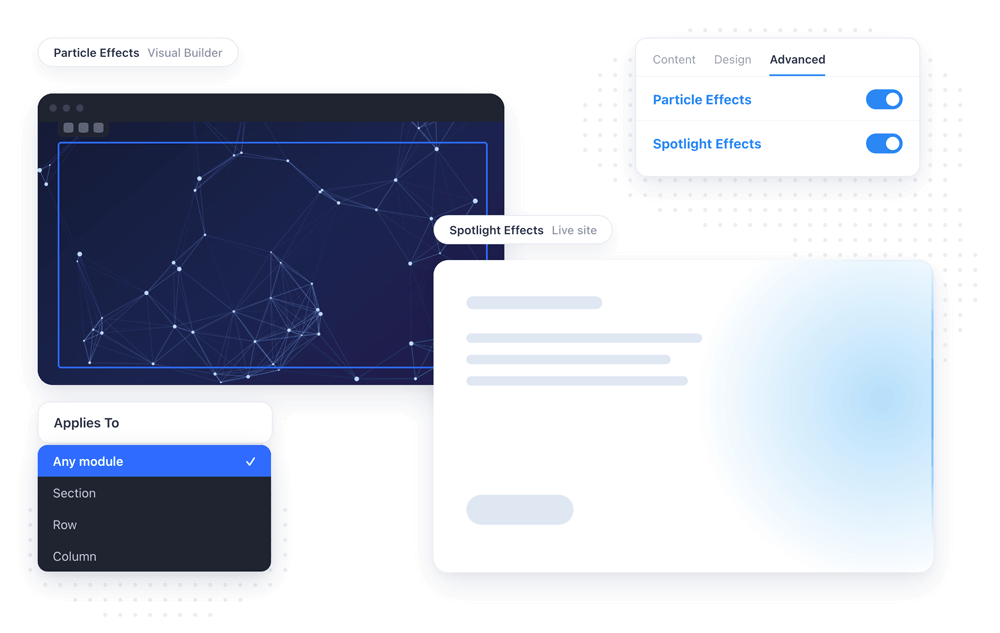
This update ships two of them: Particle Effects and Spotlight Effects. Neither one is a module. Both add a new option group to the Advanced tab of every Divi 5 module, row, column and section, with a live preview right inside the Visual Builder. No custom CSS class, no code snippet, no extra element in your layout — you open the settings of the thing you already built and switch the effect on.
Contents
Spotlight Effects: a glow that follows the cursor
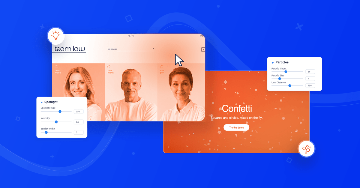
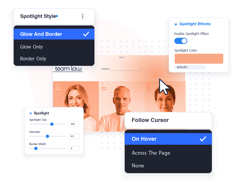
Spotlight Effects paints a soft light that tracks your visitor's cursor across an element. It can wash over the whole element, run as a bright line along its border, or do both at once — the look that makes dark pricing tables, feature boxes and call-to-action sections feel alive under the mouse instead of flat.
The light is yours to shape. Pick its color, or pick two and the spotlight becomes a gradient. Size and intensity take it from a barely-there sheen to a hard beam, and the border light has its own width. You also decide how closely it follows: it can light up only while the cursor is over the element, or stay lit and lean toward the cursor as it moves anywhere on the page.
Not every visitor hovers, though, and a card nobody touches shouldn't sit there dead. So the spotlight can also move on its own, traveling the element along a circular, horizontal, vertical, diagonal or figure-eight path at whatever speed you set. The automatic motion knows when to step aside: it pauses the moment the cursor enters and hands control to the visitor, then picks up again from the exact point the cursor left, so there is no snap back to the beginning.
On a Blog module, lighting the whole grid as one block would look wrong — so it doesn't. Each post gets its own spotlight and reacts on its own as the cursor passes over it, and the effects survive a re-render, whether that is you changing a setting in the builder or a visitor paging the grid on the frontend.
Particle Effects: animated backgrounds, per element
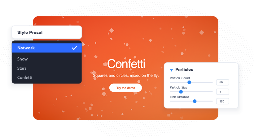
Particle Effects fills any element with animated particles — the drifting, connected network you have seen on hero sections, now available on any section, row, column or module you like. We rebuilt it on tsParticles, the modern successor to the old particles.js library, and that rewrite is what makes the rest of this possible.
The quickest way in is the Style Preset dropdown: two dozen ready-made looks, from Snow, Rain and Fireflies to Confetti, Matrix, Bokeh, Hyperspace, Black Hole and Comet Trails. Pick one and the element is finished. A preset is a starting point rather than a lock, though — anything you change keeps your value, and everything you leave alone follows the preset. Choose Snow, raise the count and swap the color, and the rest of the snowfall stays snowfall.
Underneath, the settings sit in collapsible groups covering the particles themselves, their shape, movement, extra effects, link lines, collisions, interactivity and layering. Particles are no longer limited to geometry: alongside circles, stars and polygons they can be emoji, text, or any image from your media library. They can carry a palette of up to five colors and cycle through the color wheel, twinkle, wobble, rotate, tilt like paper fluttering or roll with shading on the back side. Link lines can fill the triangles between particles, particles can bounce off, absorb or destroy each other, and the whole field can render behind your content or in front of it — a snowfall over your text, with everything underneath still clickable.
Then there is what happens when a visitor touches it. Hovering can grab particles with reaching lines, bubble them, repel them, attract them, connect them, leave a trail, or slow the field to a crawl; clicking can add or remove particles, pull them in, push them away, or pause the animation altogether. Every mode arrives pre-tuned, so it is one dropdown and a look, not an afternoon of dialing in numbers.
Divi's global colors work throughout, alpha channel included, so particles and link lines stay linked to your palette the way everything else in the builder does.
Built for Divi 5, not bolted onto it
Both features register on Divi 5's own module filters. That is why they appear on everything, including modules that don't ship with Divi Pixel, and why the Visual Builder preview is the real effect rather than an approximation — the Visual Builder and the frontend run the same engine, so what you design is what your visitors get.
They are also careful about weight. Nothing loads on a page where nothing uses the effect. The scripts are registered up front and only enqueued when a module on that page actually turns the effect on, and the overlay that carries the spotlight never captures a click — buttons and links underneath keep working exactly as before.
How to turn them on
Both features are off by default, so your existing pages stay untouched until you decide otherwise.
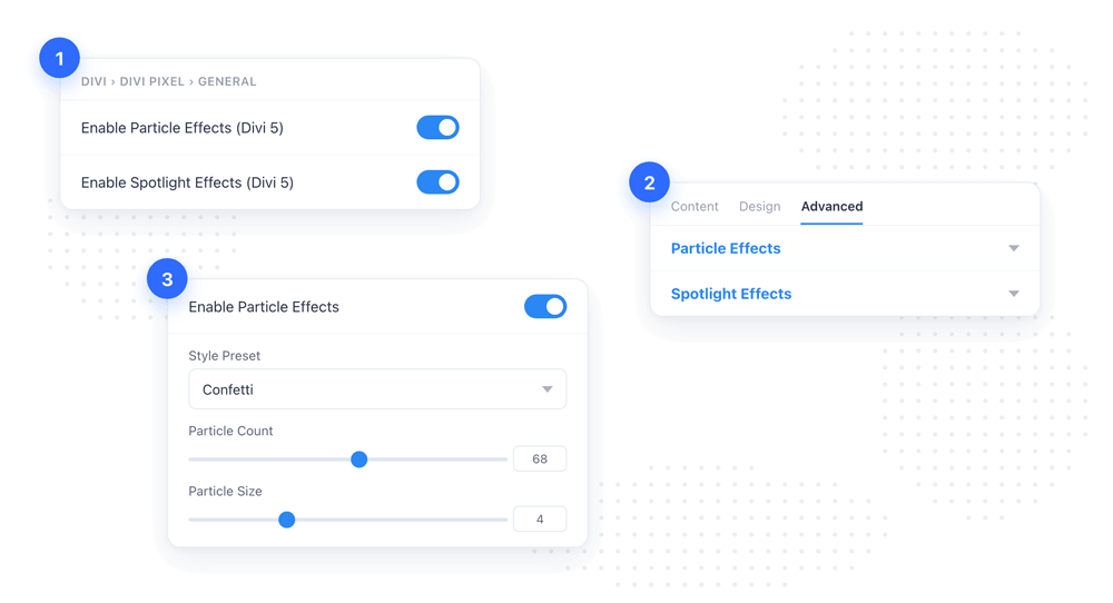
- Go to Divi → Divi Pixel → General.
- Switch on Enable Particle Effects, Enable Spotlight Effects, or both, and save.
- Open any page in the Visual Builder and open the settings of a module, row, column or section.
- Go to the Advanced tab and open the new Particle Effects or Spotlight Effects group.
- Enable the effect and start tuning — the preview updates as you go.
Every setting is documented in detail in our documentation.
Also in this update: autoplay and progress bars
Two modules picked up something in the same release. Advanced Tabs can now run on its own: switch Autoplay on, set how long each tab stays open, and the module cycles through them by itself. It respects the visitor — clicking or hovering a tab restarts the countdown from that tab rather than yanking them somewhere a second later — and when the tabs slider is on, the newly activated tab scrolls itself into view.
Both Advanced Tabs and the Hover Gallery also gained a progress bar for their autoplay. It sits on the active tab or item and fills as the time runs down, so visitors can see the switch coming instead of being surprised by it. You choose which edge it sits on, how thick it is, and the color of both the track and the fill, all from the module's Design tab.
Cycles on its own — no click needed.
Progress bar shows what's coming next.
Hover to pause. Take over any time.
Update Divi Pixel from Dashboard → Updates to get both features. Not using Divi Pixel yet? It bundles 50+ Divi 5 ready modules and dozens of theme and builder enhancements, backed by our 14 day money back guarantee.
Build something bright, and show us what you make in the Divi Pixel Community — the effects we ship next usually start as somebody's request there.

Maciej Ekstedt
Maciej, co-founder of Divi Pixel, is a passionate web designer with over 15 years of experience. He has developed dozens of loved Divi products that have earned recognition from the global community. When he's not working on new ideas, he enjoys gardening, walking his dog, and spending time with friends.
Enhance your Divi Theme with Custom Settings and New Modules. Start Creating Awesome Websites with the Divi Pixel
We offer a 14 Day Money Back Guarantee, so joining is Risk-Free!